CASE STUDY
Nami
Brand Identity & Social Media Launch
YEAR
2024
DURATION
4 months
ROLE
Brand Strategist & Creative Director
LOCATION
Utrecht, Netherlands
OVERVIEW
Nami arrived in Utrecht as a new kind of ramen spot — intimate, ingredient-led, and quietly ambitious. The challenge was to build a visual identity that felt genuinely Japanese without leaning on tired tropes, and a social presence that could build an audience from nothing before the first bowl was even served.
"Nami (波) means wave in Japanese — a rhythm, a force, something that keeps coming back. The brand had to carry that."
— Brand Philosophy
KEY RESULTS
2K+
Pre-Launch Following
Audience built before doors opened
Sold Out
Opening Week
Reservations filled within days of launch
Strong
Brand Recognition
Immediate local recognition in Utrecht
PROJECT DETAILS
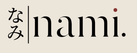
Logo & Visual Language
The identity pairs a minimal wordmark with a water stamp motif — a nod to traditional Japanese seals. Clean, confident, and legible at every scale. Every bowl is a conversation between tradition and the present moment. Made with care. Served with intention.
Instagram Content — @nami.utrecht
I developed the full content strategy, tone of voice, and visual templates for the @nami.utrecht account — building an audience before the restaurant's opening through a mix of atmospheric photography, process content, and considered storytelling.
FEATURED POSTS
See the work in action on Instagram.
CHALLENGES
- 1
Creating an authentic Japanese visual identity without relying on clichés or stereotypes
- 2
Building anticipation and an audience before the restaurant even opened
- 3
Establishing a distinctive voice in Utrecht's growing food scene
SOLUTIONS
- 1
Developed a minimal wordmark paired with a traditional water stamp motif — a nod to Japanese seals
- 2
Created a content strategy mixing atmospheric photography, process content, and considered storytelling
- 3
Built a cohesive Instagram presence that made the restaurant feel like a destination before it existed
Interested in similar results?
Let's discuss how we can transform your brand.